PROCESS HIGHLIGHTS
Design challenge and responsibilities overview
Challenge
Design an app that provides a seamless, user-friendly experience for customers seeking to rent a car quickly and efficiently.
Opportunity
Develop an integrated platform to optimize rental processes, enhance user retention, and maximize operational efficiency.
Timeline
Nov 2022 - June 2023
Responsibilities
UX Research
Prototyping
UX/UI Mobile Design
User Interface Design
Tools
Figma
Adobe Creative Suite
Procreate
Slack
Prototyping
Disciplines
User Experience Design
User Interface Design
BACKGROUND
Our Vision
Recognizing that the world of transportation is rapidly evolving, we envision a future where every journey is personalized and seamlessly connected. Through our app, we strive to empower users in several key ways. These include providing effortless access to a diverse range of vehicles, enhancing engagement with tailored experiences and real-time support, rewarding sustainable choices, gathering valuable feedback through interactive surveys, and fostering genuine relationships within our community of drivers and renters.
The Process
1
Research
Identifying Problems
Desk Research
Competitor Analysis
User Surveys
2
Synthesis
Persona
User Journey
3
Ideation
Developing a Solution
Moodboard
Low Fidelity
Mid Fidelity
High Fidelity
Major Improvements
4
Final Designs
Design System
UI for Launch
5
Reflection
Post Designs
Post Thoughts
RESEARCH
Initial Problem Discovery
Moreover, while car rental apps have emerged to streamline some aspects of the process, many still lack personalized experiences, real-time support, and a sense of community among users. They often provide generic services without addressing individual preferences or fostering meaningful connections between drivers and renters. Recognizing these shortcomings, we set out to address these issues with Hola Fleet. Our goal is to revolutionize the car rental experience by offering a seamless, user-friendly platform that not only simplifies the rental process but also builds genuine relationships within our growing community


RESEARCH
Desk Research
To build a strong foundation for the design phase, I first immersed myself in focused desk research on the car rental industry and the use of car rental apps. Utilizing websites, industry reports, and recent articles, I aimed to identify key statistics and insights specific to consumers renting cars through apps and the challenges faced by car rental companies in the digital landscape.
User’s Perspective
Inadequate support and slow response times leave users feeling frustrated.
Users often face lengthy and complicated booking procedures.
Hidden fees and unclear pricing structures make it difficult for users to anticipate the total cost of a rental.
Rental services often fail to offer personalized recommendations.
Brand’s Perspective
The rise of ride-sharing platforms increases market competition.
Companies find it difficult to build loyalty due to lack of personalized experiences.
Implementing new technologies for booking, fleet management is challenging and costly.
Without robust data analytics, companies struggle to understand customer behaviors and preferences.
83%
customers are willing to pay more for a car rental app that offers a better customer experience.
80%
users express a strong preference for car rental apps that provide transparent pricing and eliminate hidden fees.
70%
of consumers are more likely to use a car rental app that provides real-time customer support and assistance.
RESEARCH
Competitor Analysis
Although our app is something that hasn’t been done before, we wanted to take a closer look at the companies that have attempted to enhance their in-person shopping experience, whether through integrating coffee shops or juice bars within their retail space or by hosting engaging events, and examine their levels of success or failure.

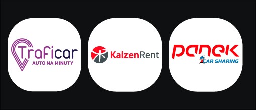
Traficar is a car-sharing company primarily operating in Poland. It offers a convenient, app-based service that allows users to rent vehicles on-demand for short periods, paying only for the time and distance used.
Kaizen Rent is your trusted partner for seamless and convenient car rental services. Embracing the philosophy of continuous improvement, we offer a diverse fleet of well-maintained vehicles to meet your travel needs.
Panek is a prominent Polish car rental and car-sharing company. It offers a diverse fleet of vehicles accessible through an app-based platform, enabling users to rent cars on-demand in major cities across Poland. Panek focuses on providing convenient, flexible mobility solutions to meet the varying needs of its customers.
RESEARCH
User Surveys
Although our app is something that hasn’t been done before, we wanted to take a closer look at the companies that have attempted to enhance their in-person shopping experience, whether through integrating coffee shops or juice bars within their retail space or by hosting engaging events, and examine their levels of success or failure.
User Pain Points
And after these 500 surveys, we can conclude that:
60%
of people in digital communities want more places to meet IRL
60%
of consumers expect more space in retail stores to be devoted to experience rather than product by 2025.
80%
of brands matched or exceeded their pre-pandemic spend as Brands are investing in experiential marketing
81%
of Gen Z prefer to shop in stores vs online. They see it as a social excursion.
Digital targeting will become even more difficult and expensive. Brands will continue to turn to new marketing channels, like brick-and-mortar and pop-ups.
SYNTHESIS
User Persona
I wanted to create a user persona to embody the ideal Visavis user based on the full research process I conducted, incorporating insights from the problem discovery, user surveys, competitor analysis, and major pain points. By synthesizing the gathered data, my aim is to represent the user's preferences, pain points, and behaviors, allowing for a more focused and effective redesign for our ideal user.
SYNTHESIS
User Journey
I created a user journey to map out how Jackson, our ideal Visavis user, would navigate his current situation, aiming to understand the highs and lows of his emotions while trying to meet with new people in person. This comprehensive visualization provides valuable insights into Jackson’s experience, enabling a targeted redesign to optimize user engagement for brands and satisfaction for users.
IDEATION
Developing a Solution
With Visavis' technology, brands can open shoppable social spaces. This means that within the Visavis app, brands can offer their niche communities a venue for gathering, curated shopping and events, and more, ultimately leading to the highest quality in-person experience.
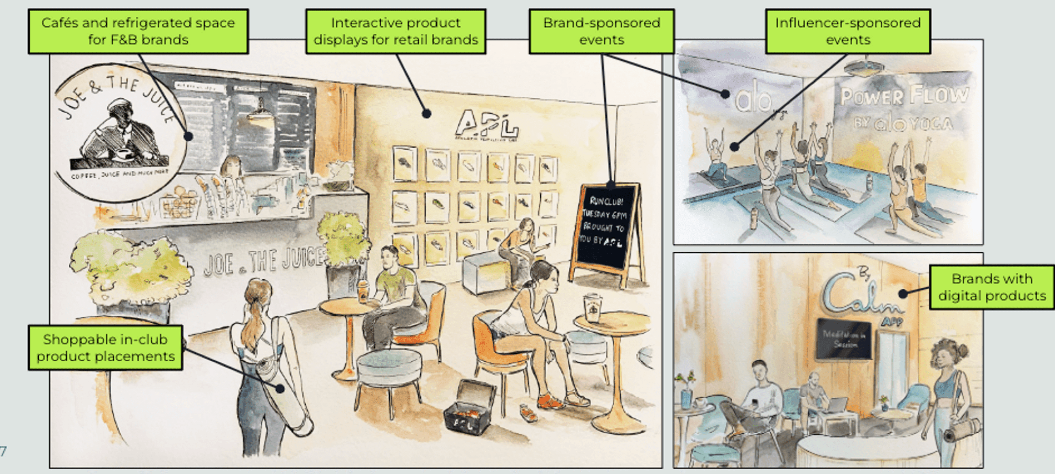
Redesign Goals:
Help new customers discover you without the expense of digital ads.
Incentivize return visits and engagement with points & rewards.
Host in-store events with greater reach and stronger ROI
Learn about your community through surveys and generate revenue-driving loyalty
Message your customers with the content they’re most likely to engage with.
IDEATION
Moodboard
Following the User Flows, I delved into researching mobile apps and websites renowned for their exceptional user experience and user interface design. This research served as a valuable resource for my ideation process, as it enabled me to generate ideas based on designs that have successfully delighted users. Additionally, it helped me identify essential elements that should be included in the app, as well as discern what features may be unnecessary.
IDEATION
Low-Fidelity
Here are some of my initial thought processes regarding our research and the goals for our app. The low-fidelity designs provided us with the first glimpse of how our app could potentially work, with all the key functionalities implemented.
IDEATION
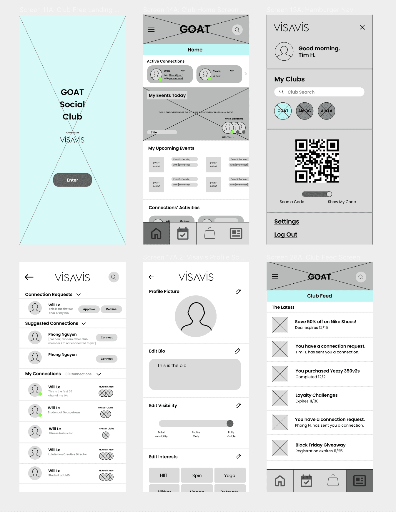
Mid-Fidelity
Our "Ugly Duckling" stage was dedicated to ensuring that the UX of our app aligns with the users' needs in terms of usability and functionality. Here are some of the wireframes:
IDEATION
High-Fidelity (Sales Deck)
Although I constantly updated the UI to accommodate functionality changes, I began exploring high-fidelity design concepts to envision the potential appearance of the app. Drawing inspiration from renowned companies such as Apple, Spotify, Nike, and others, I developed my own unique style while staying updated on the latest UI trends. These designs were predominantly featured in slide decks, as the ones used for development still required UX enhancements.
IDEATION
Major Improvements + Design Decisions
In terms of the actual high fidelities for launch, we conducted user testing throughout the process with my team, potential investors, brands, and customers. I'll be discussing the three major improvements/design decisions we implemented to satisfy the user needs and brand identity.
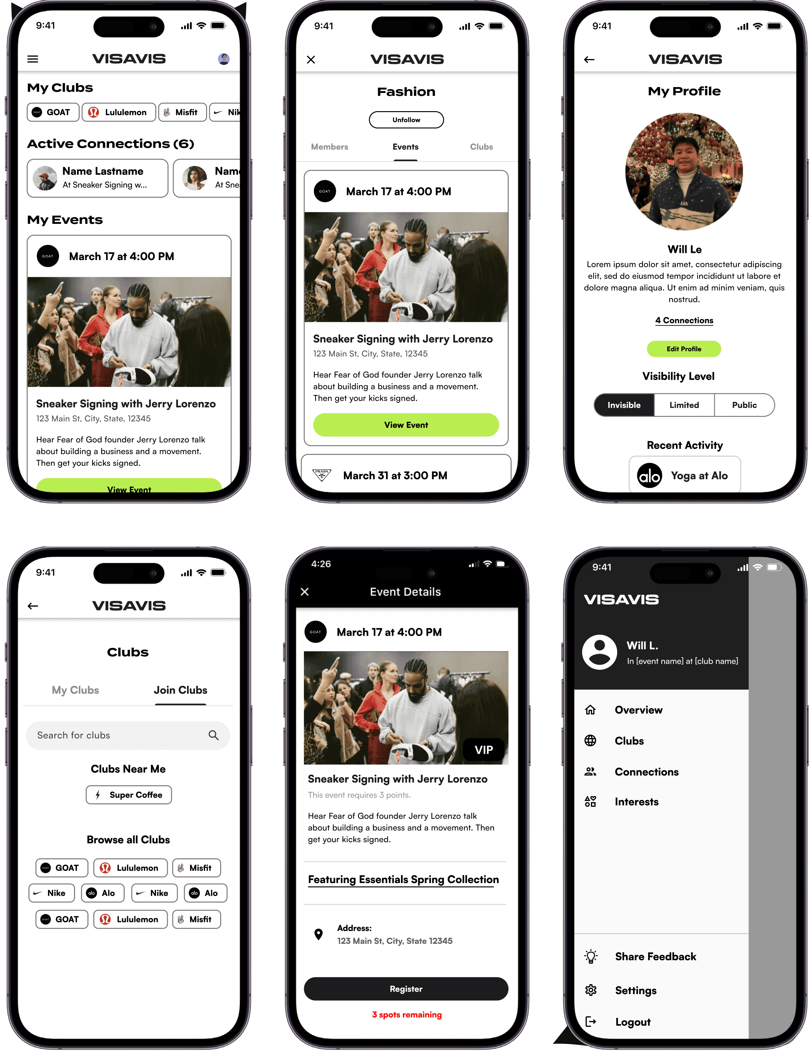
Navigation
After thorough user testing throughout the process with my team, potential investors, brands, and customers, here was one of the biggest area I improved to satisfy user needs and wants.
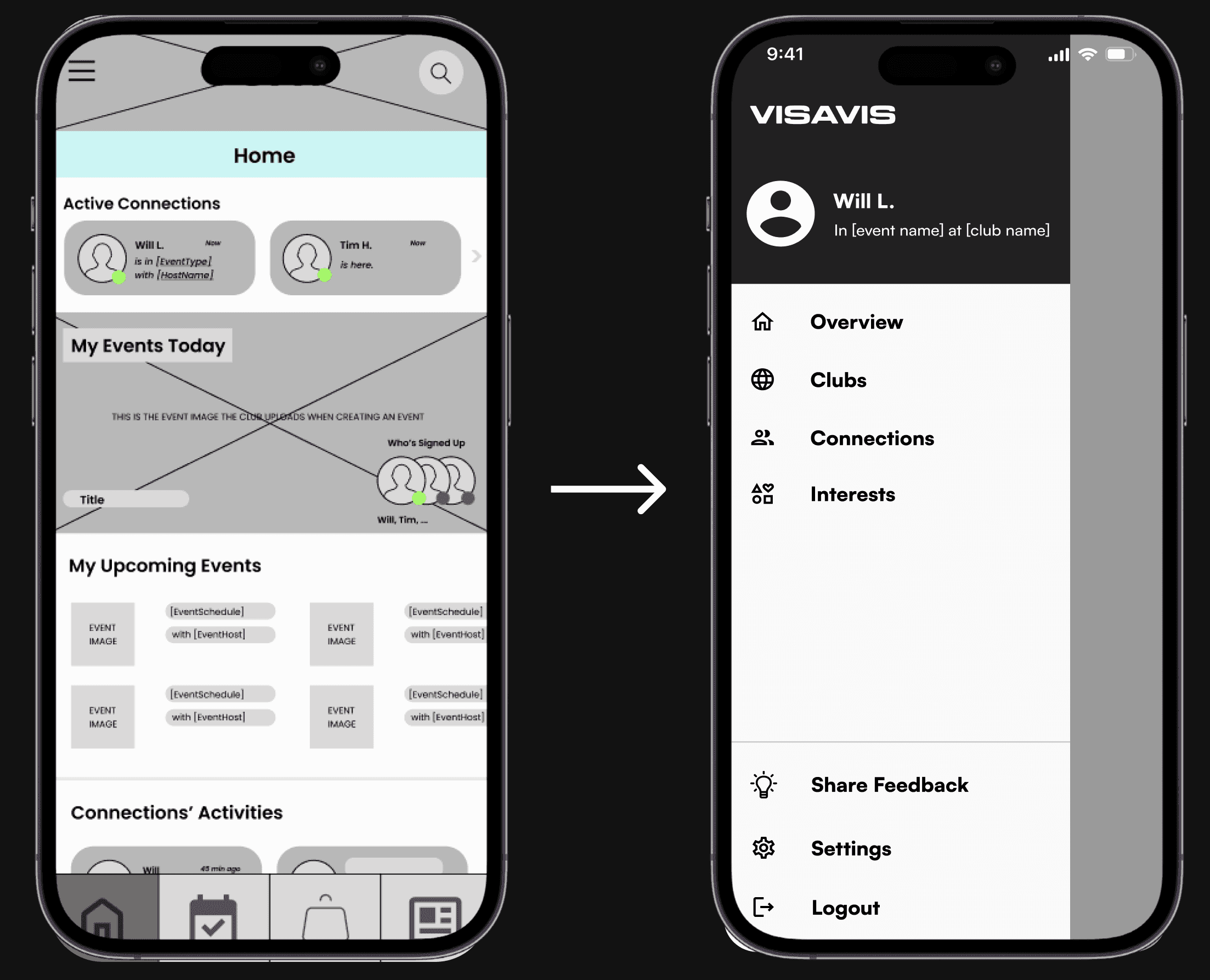
The navigation system from Visavis’ Screens to Club Screens
Removing the bottom navigation, as it can cause confusion when switching between Visavis' Home Screen and a Club's Home Screen.
Side navigation provides easy access to the overview, as well as all your clubs, connections, and interests.
Design Decision (Color)
The next major design decision was deciding on the color scheme. After conducting color theory research, we learned that the color green represents "new beginnings and growth," and we wanted to move towards that path. Another crucial aspect we had to consider was designing for accessibility.
Empty State
Recognizing the importance of avoiding excessive white space in our app, the last major improvement involved exploring how other successful companies handle empty states.
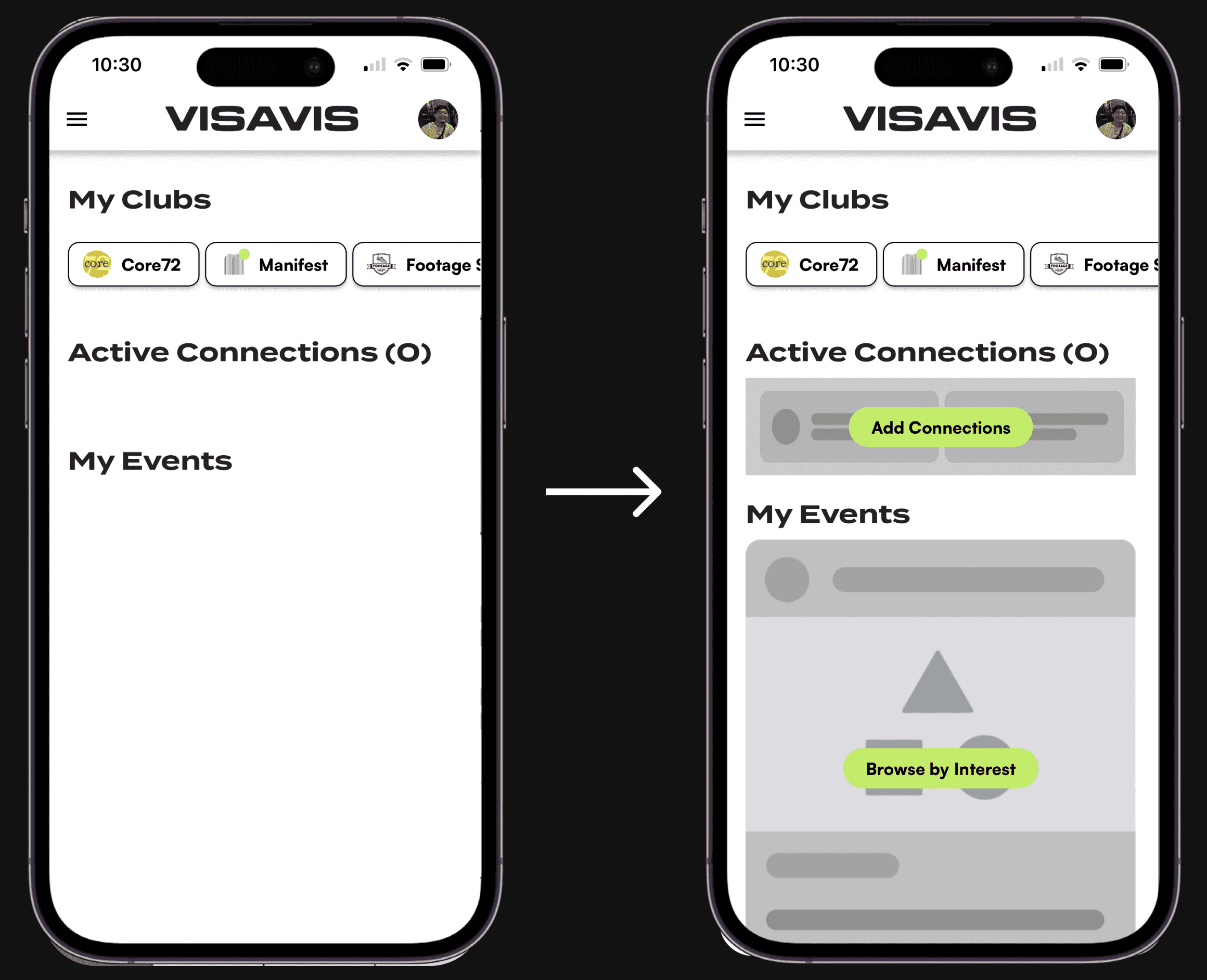
Improving Empty State Designs: Addressing Challenges within Startups
To address this challenge, we implemented a solution: a gray placeholder. This approach, commonly used for loading and empty screens, not only minimizes white space but also conveys a sense of incompleteness.
The central green action button was strategically placed to guide users and help them find alternatives for the gray screens.
FINAL DESIGNS
Design System
With the creation, iteration, and completion of thousands (yes, thousands!) of wireframes, I successfully finalized the UI Designs for our Pilot phase. To achieve this, I utilized Google's Material 3 UI Components to create the final wireframes. With assistance from another UI Designer, we created a detailed Design System/Style Guide page, which significantly improved consistency in terms of white space, balance, and unity within my designs. This allowed the developers to have easy access to all our design specifications and begin implementing them in the TestFlight app using Flutter.
FINAL DESIGNS
UI for Launch
REFLECTIONS
Post Designs Outcome
Market Validation
40 signed brand LOIs in two months (January and February)
8 signed brand contracts in one month (April-May)
800+ person waiting list for the app
Product Development
Finished MVP (April 2023)
Wrapped Pilot Testing (May 2023)
Public Launch on Apple and Google Play Store (June 2023)
REFLECTIONS
Post Designs Outcome
My Key Takeaways
It is always important to understand who your target audience is
Taking inspiration from other companies is okay
How time consuming the wireframing process is
Understanding physical components
Next Steps
Onboarding new users to Visavis + Conducting more early-stage user testing
Conduct second round of user interviews and surveys
New experiential features (specifically AR)
Understanding physical components
When Will's given tasks, he'll often deliver ahead of schedule and with a high level of accuracy and thoughtfulness. Even with his packed schedule, I never felt like our company (where Will's a freelancer) was a lower priority for him compared to the rest of his responsibilities. In fact, he's felt like a fully committed member of our team from day 1, and to us he absolutely is. I would recommend Will without hesitation to any company or team.
Bridget Regan, CEO @ VISAVIS