PROCESS HIGHLIGHTS
Web design • Development
Amor Project is a celebration of style, passion, and innovation — a fusion of timeless design and the spirit of the future. Through a thoughtfully curated collection, we invite you to embark on a journey where fashion becomes an extension of identity, art, and emotion. Every piece is crafted not just to be worn, but to be experienced — an expression of love for creativity, craftsmanship, and the bold beauty of self-expression. Amor Project transcends trends, forging a new era where clothing connects deeply with the soul, the moment, and the world around us.
Client
Commission
IDEATION
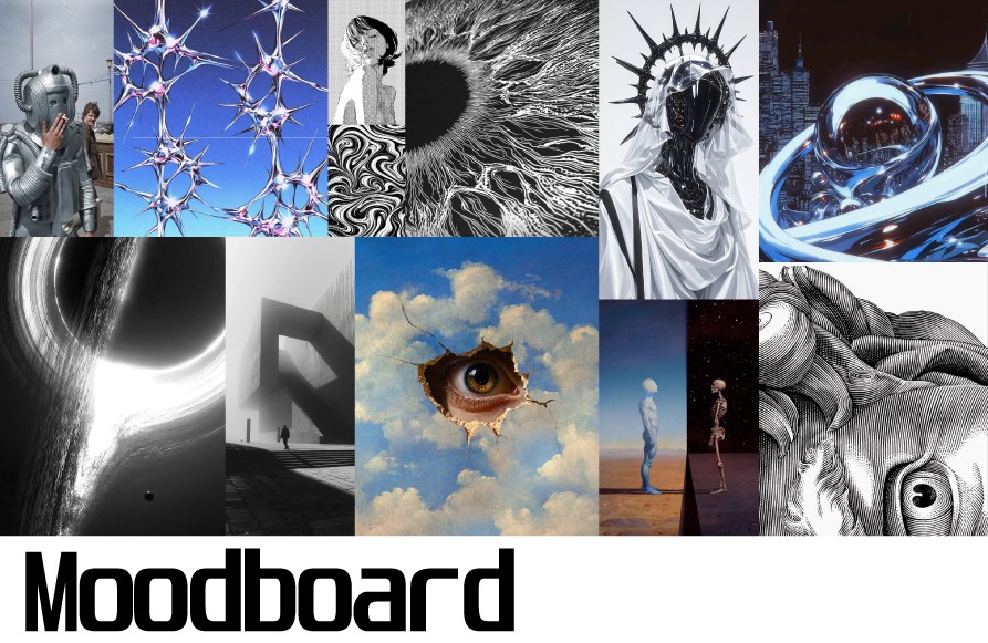
Moodboard
The visual direction was inspired by avant-garde fashion, surrealism, and futuristic aesthetics — a space where identity, technology, and emotion collide. My goal was to create a bold and provocative style that grabs attention and leaves a lasting impression. The moodboard helped translate this vision into a distinct visual language for the brand.
IDEATION
Colors
The color system was built to support both light and dark themes, ensuring accessibility and visual harmony across different user environments. The palette balances neutral tones with sharp contrast, reflecting the brand’s futuristic and expressive character.

Typography
A flexible, scalable type system was developed to support both expressive branding and functional readability across all components. The hierarchy ensures clarity across viewports, while subtle adjustments in weight and spacing reinforce a modern, tech-forward identity.

FINAL DESIGNS
Low-Fidelity
Early sketches helped define the site’s information architecture and test different content layouts. One key challenge was organizing product discovery and customization in a way that felt intuitive but stayed visually minimal. Sketching multiple versions allowed us to resolve navigation friction, avoid cognitive overload in the checkout process, and improve flow clarity from homepage to registration.


FINAL DESIGNS
Mid-Fidelity
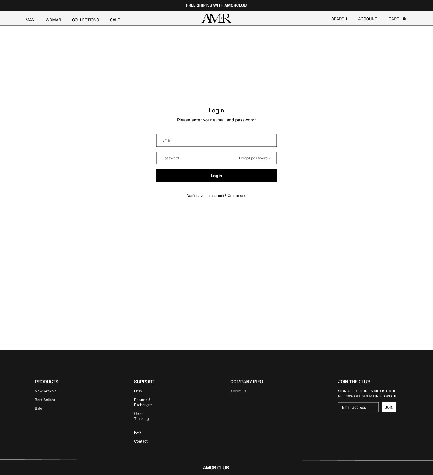
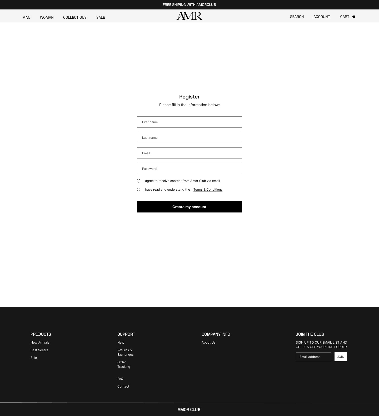
At this stage, we focused on refining interaction flows and layout hierarchy. One major challenge was optimizing the product filtering experience across screen sizes — early versions felt overwhelming or unresponsive. Iterating in mid-fidelity allowed us to simplify the layout, clarify action paths, and balance content density. We also reworked the form structure in checkout and login to reduce friction and support mobile usability


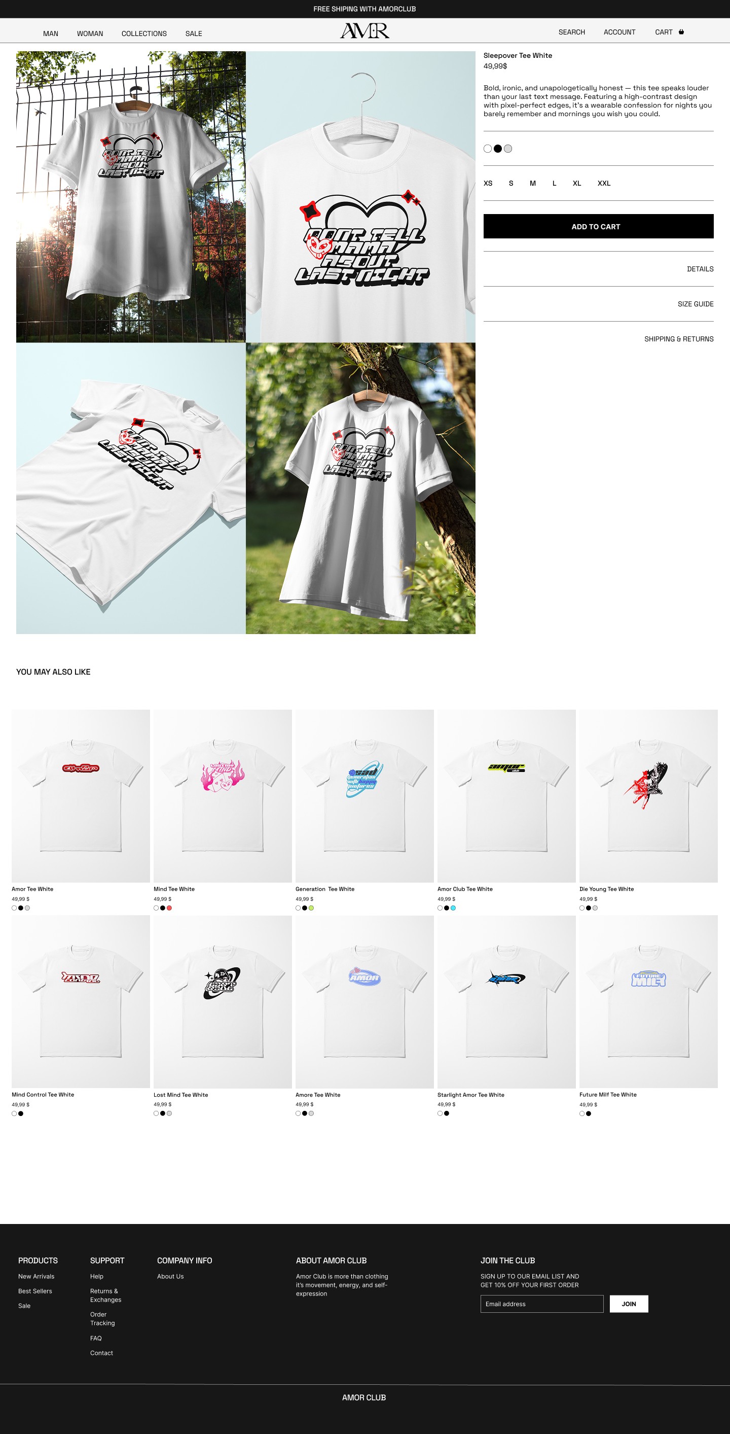
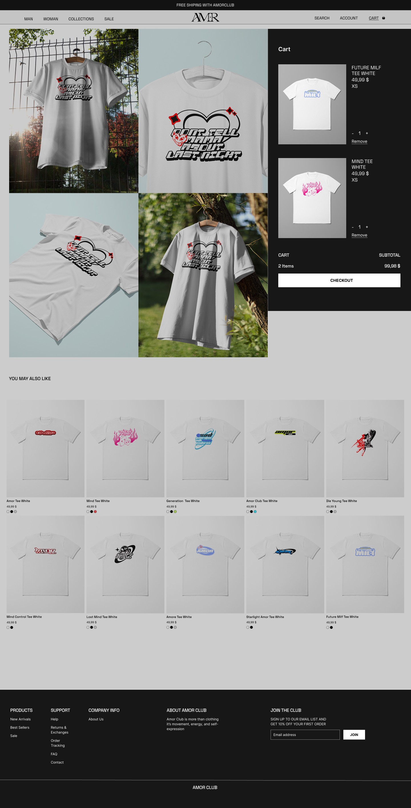
FINAL DESIGNS
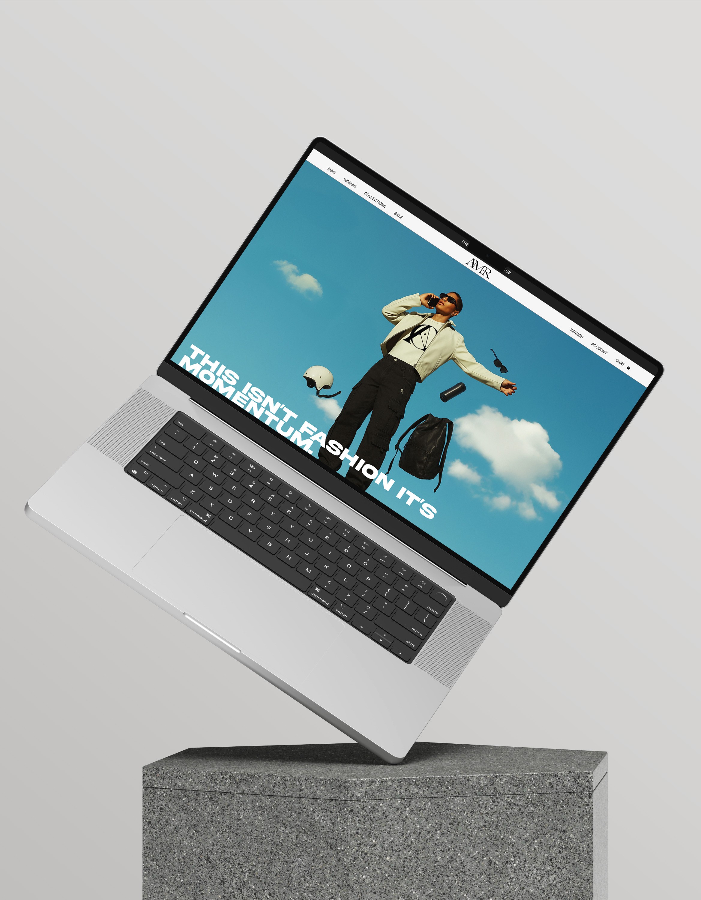
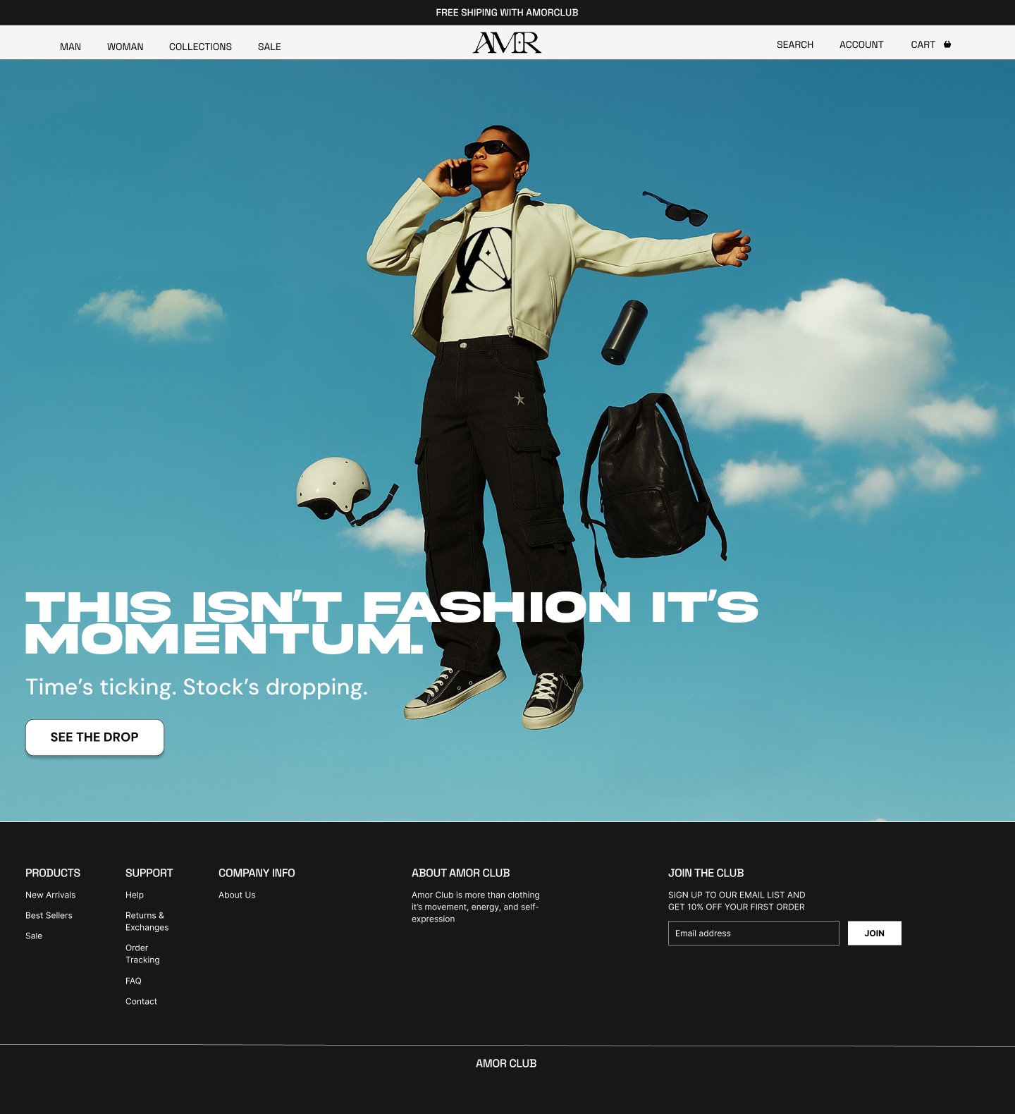
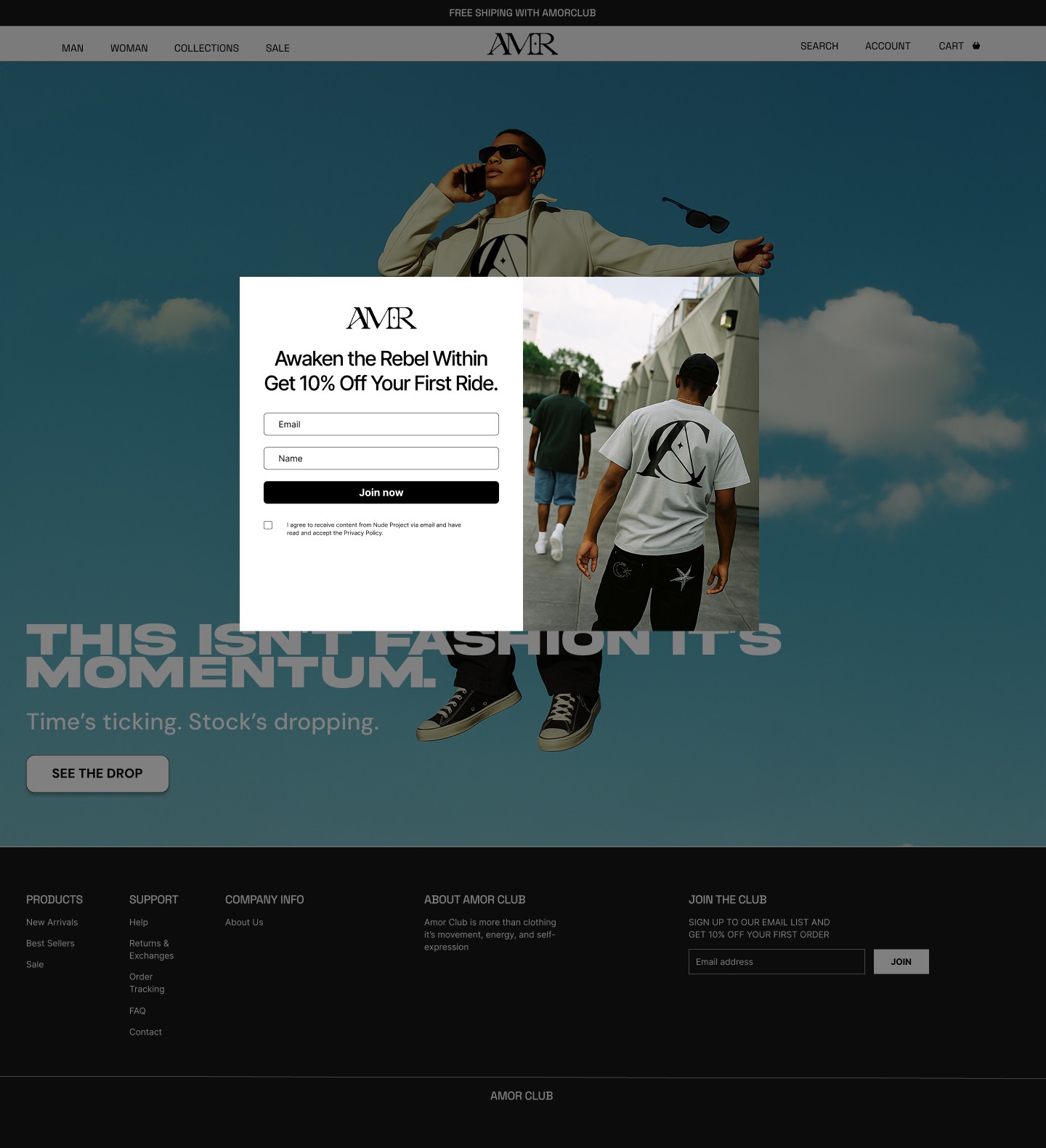
The high-fidelity phase brought the visual identity to life, blending bold typography, curated imagery, and clean layout systems. One key issue we faced was selecting the right hero image — the initial visuals lacked visual hierarchy and brand energy. By testing multiple options, we replaced it with a stronger composition that better communicated tone and motion. We also fine-tuned product layout grids, improved mobile responsiveness, and ensured that the checkout UI remained clean and intuitive despite complex purchase flows.


REFLECTIONS
Post Designs Outcome
Designing The Amor Club gave me the opportunity to fully engage with the UX process — from research and ideation to high-fidelity execution. It deepened my understanding of how visual storytelling and usability intersect, especially in fashion-driven e-commerce. Through this project, I also faced creative constraints that pushed me to be more adaptive and intentional in my design decisions.
My Key Takeaways
Drawing inspiration from existing brands is part of the creative process — and it’s valuable when done thoughtfully.
Wireframing is more time-consuming than it appears, but it’s worth every iteration.
Understanding the role of physical product components helped me bridge the gap between real and digital experience.